Intermountain Health Intranet Redesign
Client
Intermountain Health
Industry
Healthcare
Year
2023
Duration
5 months
Agency
Rightpoint
Role
UX Designer,
UI Designer
Services
User Research, Content Analysis, Wireframe, Sharepoint Template Design, Visual Design, Design System
Overview
One of the primary goals of the project was to enhance the findability of resources and tools on the intranet. By optimizing the information architecture, implementing a user-centric design system, and providing personalized experiences, Intermountain Health aimed to make it easier for employees to locate and access essential resources efficiently.
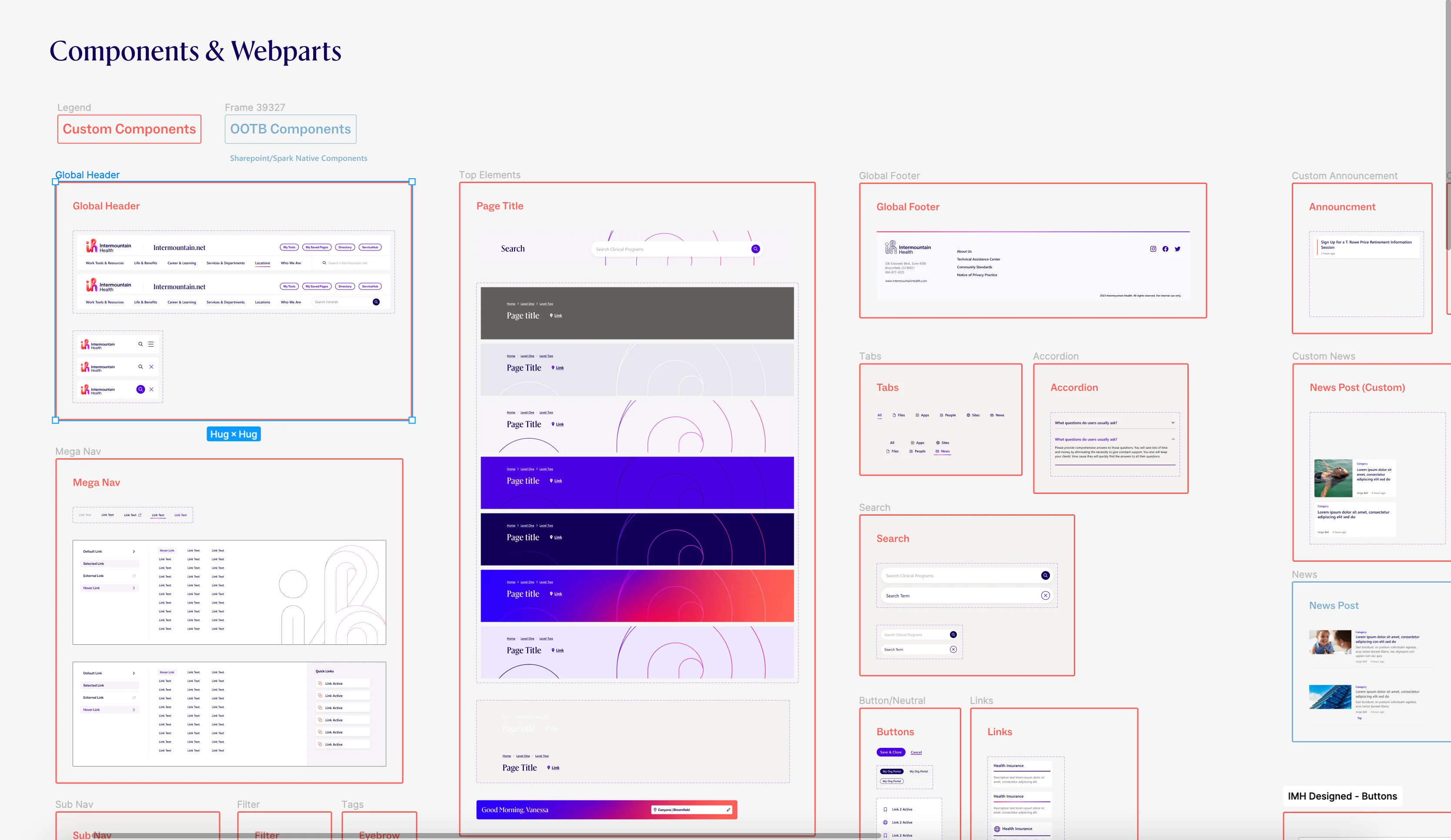
A complete redesign (new look and feel) of Sharepoint custom pages templates and webparts formed a new unified design system based on the new brand guidelines.

Design Visioning
Working with design and content to understand the right set of templates, and the key variations of main templates allowed content creation and migration of current data to be categorized and hierarchical to provide additional context to the caregiver.
Scroll
Design Approach
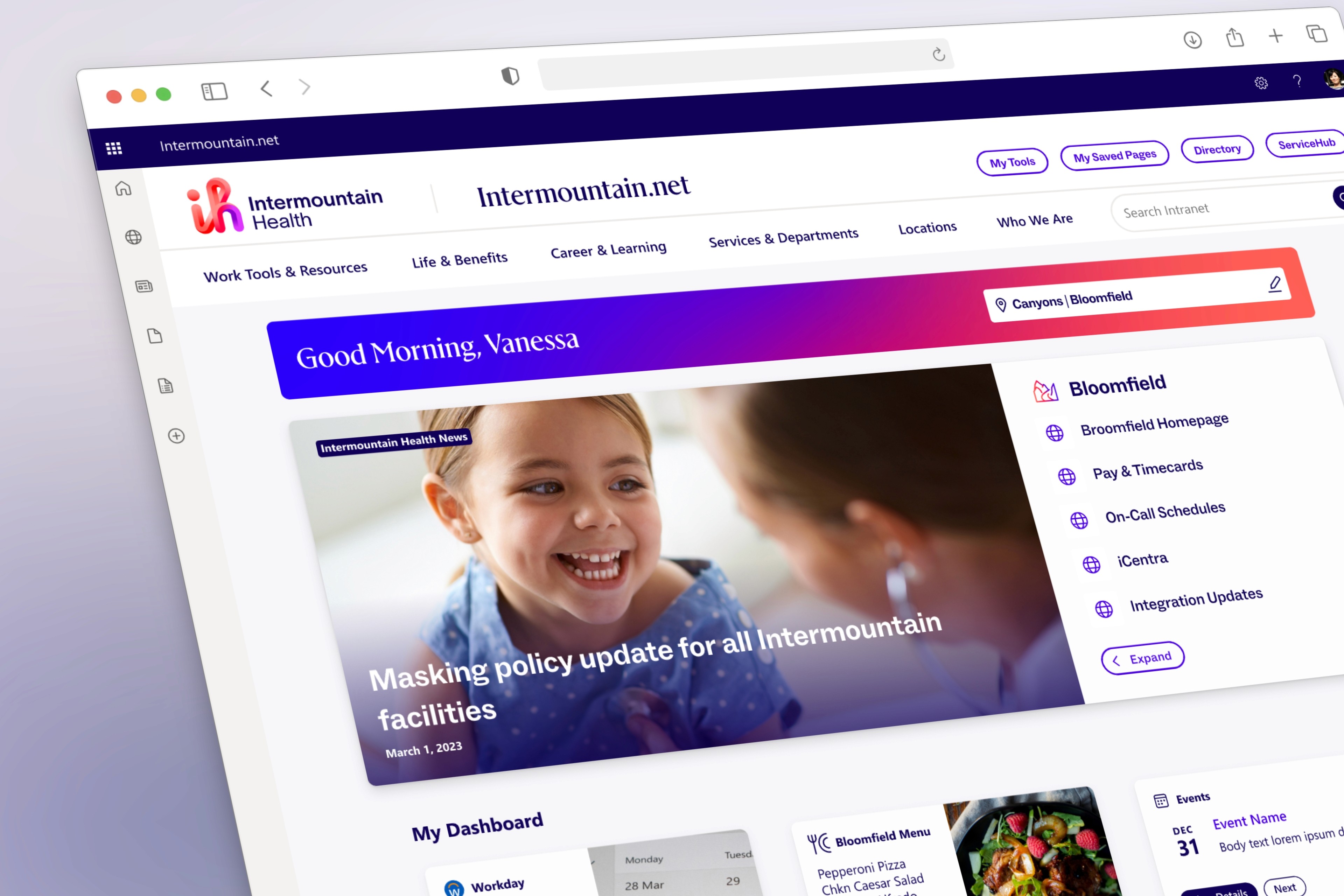
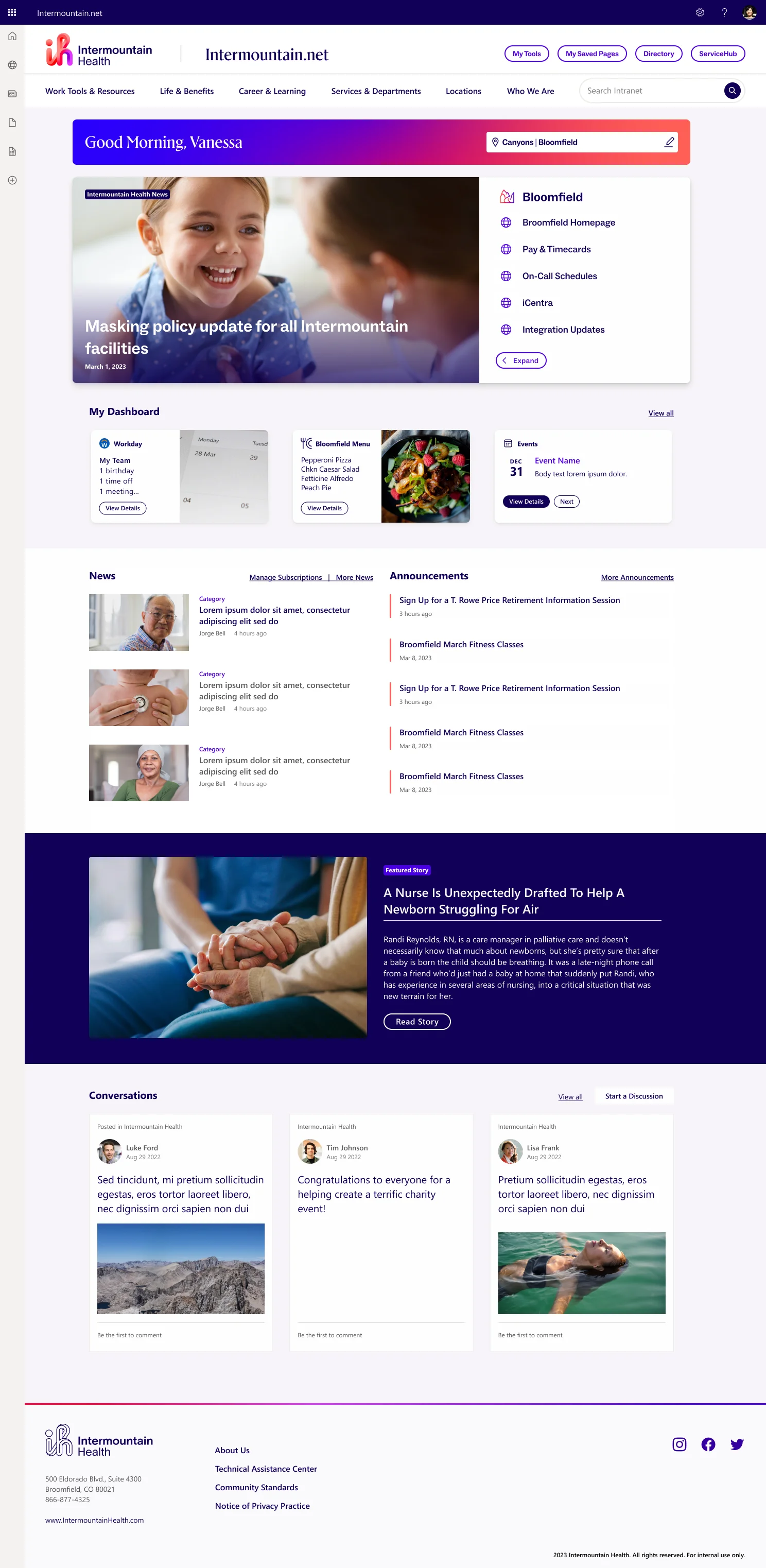
This design approach keeps the landing space uncluttered, by hiding the traditional menu using a flyout menu as a subtle way to let the high-priority content and information take centerstage. The use of extended color palette helps visually separate and accentuate the variety of news and links on the user's dashboard. Vibrant color on the landing page pulses with cheer and energy, and makes it stand apart from the aesthetic of the .com site.

Navigation consolidation
Streamlined the information architecture to improve navigation and ensure a more intuitive user experience.