weather icons example

GE Aero Alliance Portal

Client

GE & Aero Alliance

Industry

Aerospace

Year

2023

Timeframe

5 months

Agency

Rightpoint

Role

UX Designer

Scope

User Research, Content Analysis, Functional Analysis, Wireframes,  Annotation & Documentation

Overview

Aero Alliance, a joint venture between GE Power and Baker Hughes, supports customers through the fulfillment of aero-derivative engines, spare parts, repairs, and maintenance services.


The Aero Portal project aimed to improve buyers' and partners' interactions with the platform, making it easier and more efficient for them to order engine parts. The project delivered a successful and impactful solution by collaborating with key stakeholders, conducting user interviews, and defining clear requirements.

Objective

The purpose is to redesign critical areas of the current web-based Aero Store Platform. The redesigned interactions should enable a more personalized and persona-based experience, grouping of sub-sites by function, unified branding that will extend across multiple sub-sites, with the ability to extend to sub-sites that are created in the future.

weather icons example
Discovery

The process involved collaborating with key stakeholders and power users to develop personas and identify pain points through user interviews. Whiteboarding sessions helped map out solutions, while wireframes and prototypes visualized the revised interfaces. Iterative feedback loops with stakeholders and the offshore development team refined solutions, resulting in significantly improved user experience.

Through thorough data analysis and synthesis, common themes, trends, and insights were identified, providing a rich source of information for recommendations to the backend engineers and front end development team to facilitate a collaborative discussion, ensuring a clear understanding of the insights gained and review technical limitations defined by resources and project scope.

weather icons example
wireframing

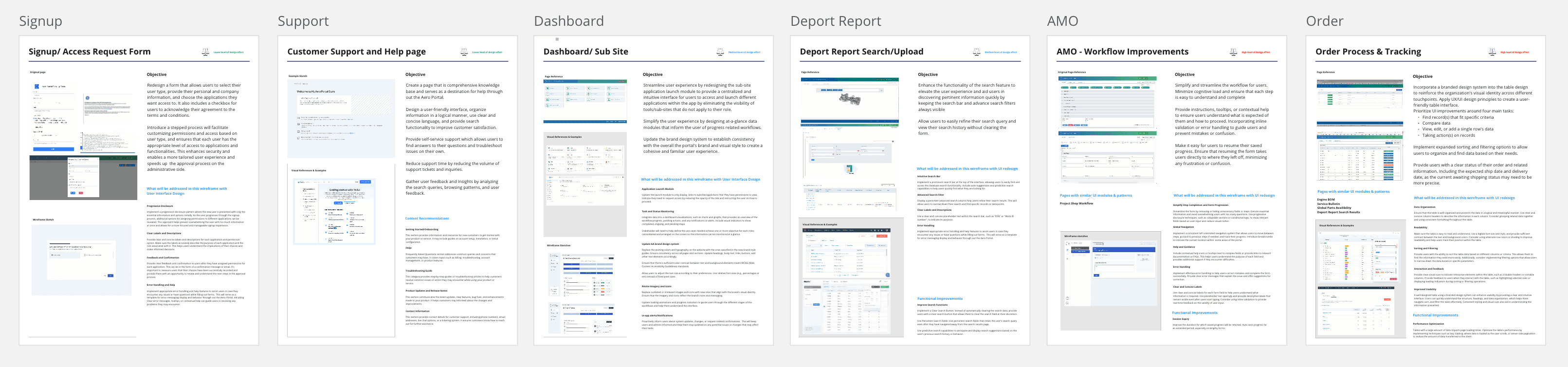
I designed UX interaction models for the recommended updates. Our design team worked together to create user-centered interaction models, wireframes, and screen mockups that addressed specific user needs and pain points. Through iterative design sessions, we refined our designs to ensure optimal usability and engagement. Each area of the site/subsite(s) experience was meticulously crafted with up to two wireframe templates, catering to diverse user preferences.

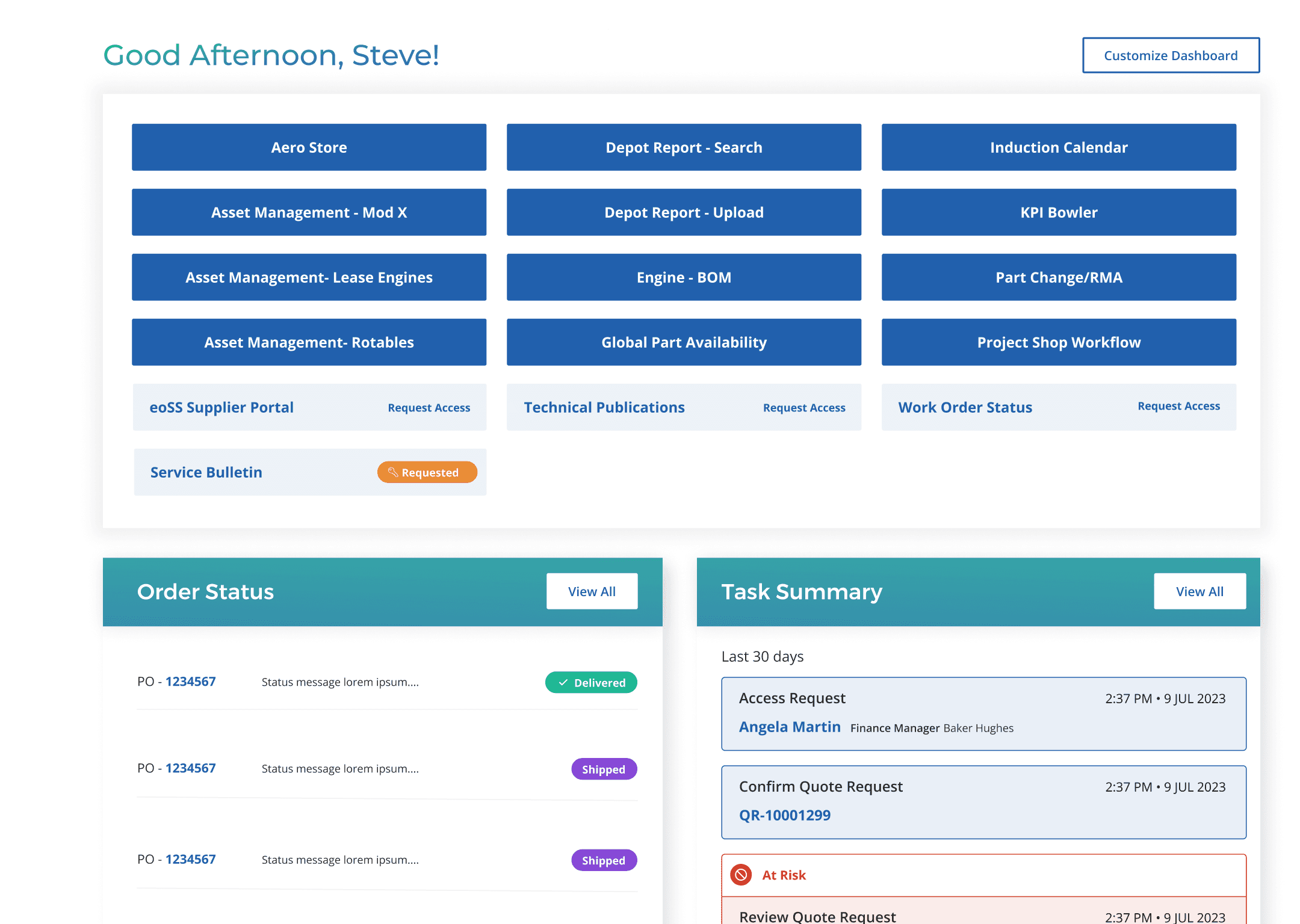
Exhibit: DAshboard

ORIGINAL
weather icons example
Pain points

The issue of users seeing all applications on the dashboard, regardless of their relevance to their role made for confusion and difficulties for the adminstrators.

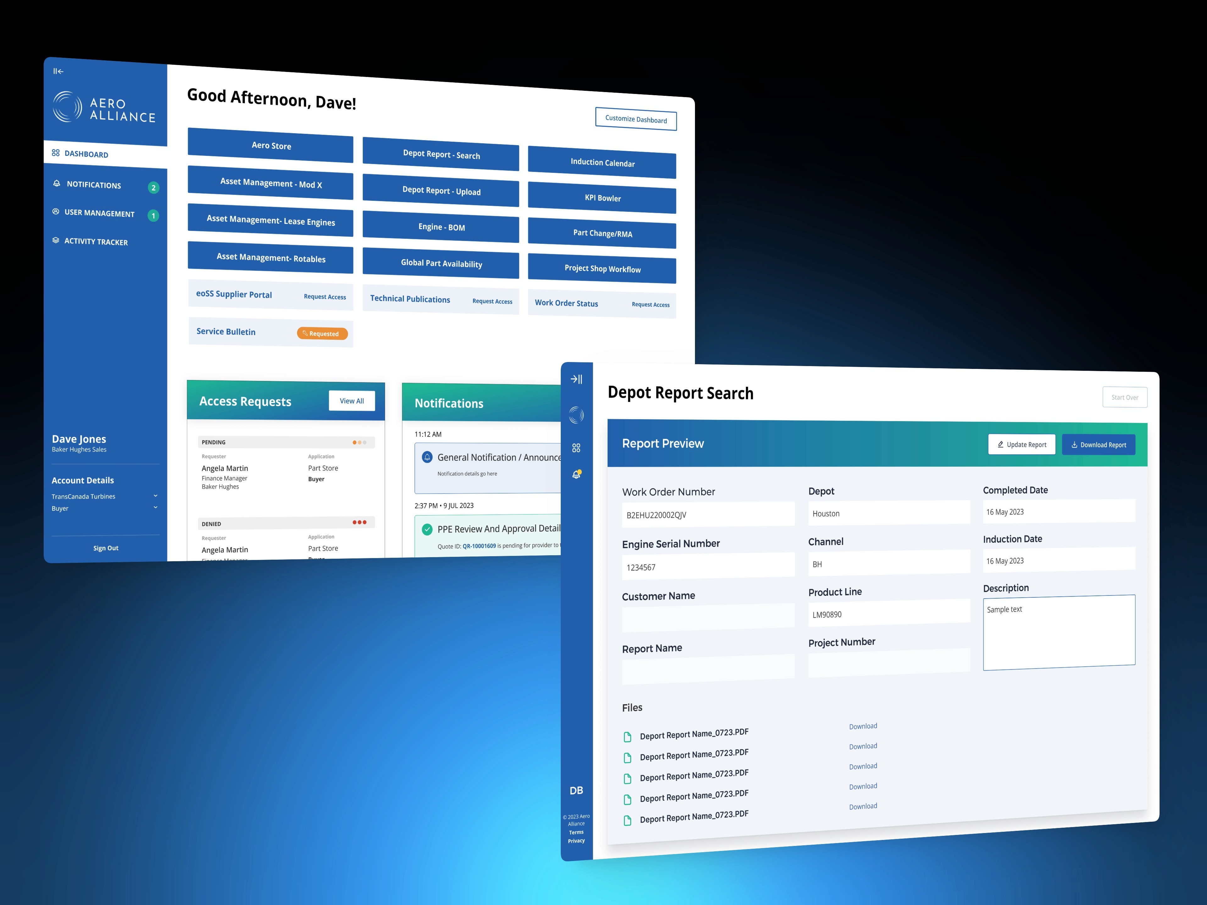
WireFRames to UI design